A Level Photography
Monday, 13 November 2017
Photoimpressionism
This photo is in the style of Claude Monet who is a french impressionist painter. He focuses on the changing of seasons in the French countryside through his paintings. My picture is similar to his painting because it shows nature and in his pictures you can see the small brush strokes he has made, similar to mine. In my photo you can see the small brush strokes however my picture is a photograph and therefore the brush strokes have been made on photoshop. The art movement his paintings belong too are the art movement photo impressionism which focuses on capturing real life without any effects which shows that photoimpressionsim artwork is figurative. Photo impressionism follows the same shot types and angles in each picture regardless of who it is taken by because the images focus on what is in the frame instead of how it is taken. In the picture above I have taken a medium close up of the fountains using a small aperture and a fast shutter speed to make sure the picture isn't over or under exposed. The picture is taken in natural lighting and the lines of the fountain act as leading lines because your eyes are automatically drawn to them. The connotations of photo impressionism are that everything has beauty as nothing is beer adjusted or edited when it is painted or photographed. I also think that the use of small strokes shows the detail in the picture and makes it look like something you can physically touch. The art work is arranged so that the white grabs your attention and your eyes are drawn to the water and the movement. I would improve this image by showing g the change in weather over a period of time similar to my photographer.
Monday, 6 November 2017
Thursday, 19 October 2017
Impressionism
Impressionism is a 19th century art movement which involves painting with small, thin brush strokes. It originated in France and focuses on capturing real life. It relates to the art movement of realism and documentary photography.
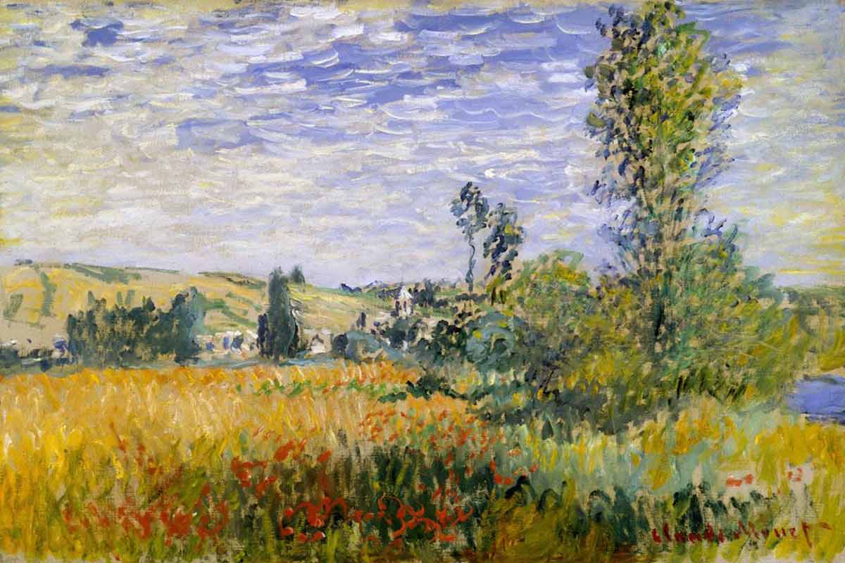
Monet was a founder of French Impressionist painting who focused on capturing perceptions of nature. Because Monet was passionate about documenting the French countryside he focused on the changing of seasons through his paintings. Because of the change of seasons between each documentary he made the light would change meaning that each of his pictures showed something different. When Monet was young he visited Paris where he experienced young painters copying from masters. This was what set off his passion for Impressionism. His photo below focuses on small strokes of exactly what he has seen. He uses composition to show the different parts of the French countryside. This connotes his love for nature and escaping the confines of a building.
Pierre-Auguste-Renior was a French impressionism documenter who was inspired by Camille Pissarro and Edouard Manet. After a series of rejections by the salon juries he joined forces with Monet, Sisley, Pissarro and several other painters. His pictures focus on portraits of people, again using small strokes to show the detail of each person he sees. I will recreate this image by
photographing a person and editing it on photoshop to look painted. Renoir uses composition to show the different elements of a persons face. This connotes that Renoir feels comfortable around people and that people have different parts to them which intrigue the artist.
Cubism Edit
This is my cubist edit in the style of Stephen McNally. I created this image by printing a picture of the town hall that i had taken, one in colour and another in black and white. I then sliced the black and white picture into strips and blocks and stuck certain bits of it onto the original in cubes and strips. This is in the style of the art movement of cubism. This shows the contrast between the black and white and the colour. I would improve this recreation by making the squares more obvious as the two pictures sort of merge together. When taking the picture I focused on light by taking the picture as a wide shot from a slightly tilted angle to connote how subordinate we are made to feel by the building. I have used a fast shutter speed and a small aperture because it was a bright day so that the picture wasn’t overexposed.
Monday, 16 October 2017
Cubism Research
Cubism is an early 20th century art movement
which historically brought European painting and sculpture forward toward
modern art. Cubism pictures are usually arranged in a collage which includes
broken down objects
 Stephen McNally is an
English based fine art photographer who focuses on landscape and street
photography. He works in the style of cubism as all of his pictures are
collages. His inspiration for the art movement comes from David Hockney whilst
L.S Lowry inspires his street scenes. The picture to the left focuses on the streets
of London but with the picture all cut up and rearranged. This could be used to
connote the lack of balance in the big cities. I will recreate this image by
using an image of the city and layering it on photoshop and cutting certain
parts out to create a building made out of different pieces similar to a
jigsaw.
Stephen McNally is an
English based fine art photographer who focuses on landscape and street
photography. He works in the style of cubism as all of his pictures are
collages. His inspiration for the art movement comes from David Hockney whilst
L.S Lowry inspires his street scenes. The picture to the left focuses on the streets
of London but with the picture all cut up and rearranged. This could be used to
connote the lack of balance in the big cities. I will recreate this image by
using an image of the city and layering it on photoshop and cutting certain
parts out to create a building made out of different pieces similar to a
jigsaw.Brutalist Edit
This edit is in the style of Simon Phipps because of the
harsh edges and the dark ora the building gives off. I have adjusted the colour
of the picture to black and white so that I am working in his brutalist style
however the picture was already part of the brutalism art movement as the
building is made out of concrete. I have adjusted the colour to represent when
the building would’ve been made and the lack of empathy we feel towards the
building. I have taken the picture from a low angle to connote how the building
makes us feel subordinate as it towers over us.I have also focused on leading
lines through the use of the pillars which lead your eyes to the top of the
building. I would improve this image by showing the desolation of the building
more by showing the empty entrance of the building. I used a small shutter
speed and a small aperture so the picture wasn’t overexposed because it was
sunny when I took the picture.
Thursday, 12 October 2017
Theme
Theme ideas
Toby Dixon is an Australian photographer who focuses on split personality order through his photography. His pictures are taken on a plain background so that he doesn’t over complicate his pictures. His pictures are in a surrealistic style as they’re showing a hybrid of personality’s and that isn’t something you can physically see. He hasn’t used photoshop on any of his pictures, what you see is exactly how he created it. I will work in this style by showing personality’s on the outside of the body in a hybrid style. I will show different characteristics on each side and occupations. His pictures are taken in a studio using studio lighting which earns he will have a small aperture and a small shutter speed as there is no movement. He has considered both narrative and composition in his pictures as each side of the body connotes something different.
- What you don't see/beyond the eye -jobs, emotions, wealth, mental health, physical health. Surrealistic style. Focus on composition and black and white to show emotions. Portraits mostly. Close ups of the face and medium close ups of the body. Landscape element based on where the pictures are taken. I will photograph people now based in comparison childhood. For example I'm going to photograph my mum who grew up in a council estate in front of where it used to be but as she is now earning a lot of money.
- Different parts of the day and different weather
- Sunset/sunrise
- Milestones in life


Toby Dixon is an Australian photographer who focuses on split personality order through his photography. His pictures are taken on a plain background so that he doesn’t over complicate his pictures. His pictures are in a surrealistic style as they’re showing a hybrid of personality’s and that isn’t something you can physically see. He hasn’t used photoshop on any of his pictures, what you see is exactly how he created it. I will work in this style by showing personality’s on the outside of the body in a hybrid style. I will show different characteristics on each side and occupations. His pictures are taken in a studio using studio lighting which earns he will have a small aperture and a small shutter speed as there is no movement. He has considered both narrative and composition in his pictures as each side of the body connotes something different.
Subscribe to:
Comments (Atom)


